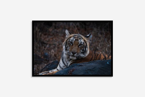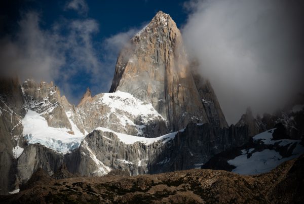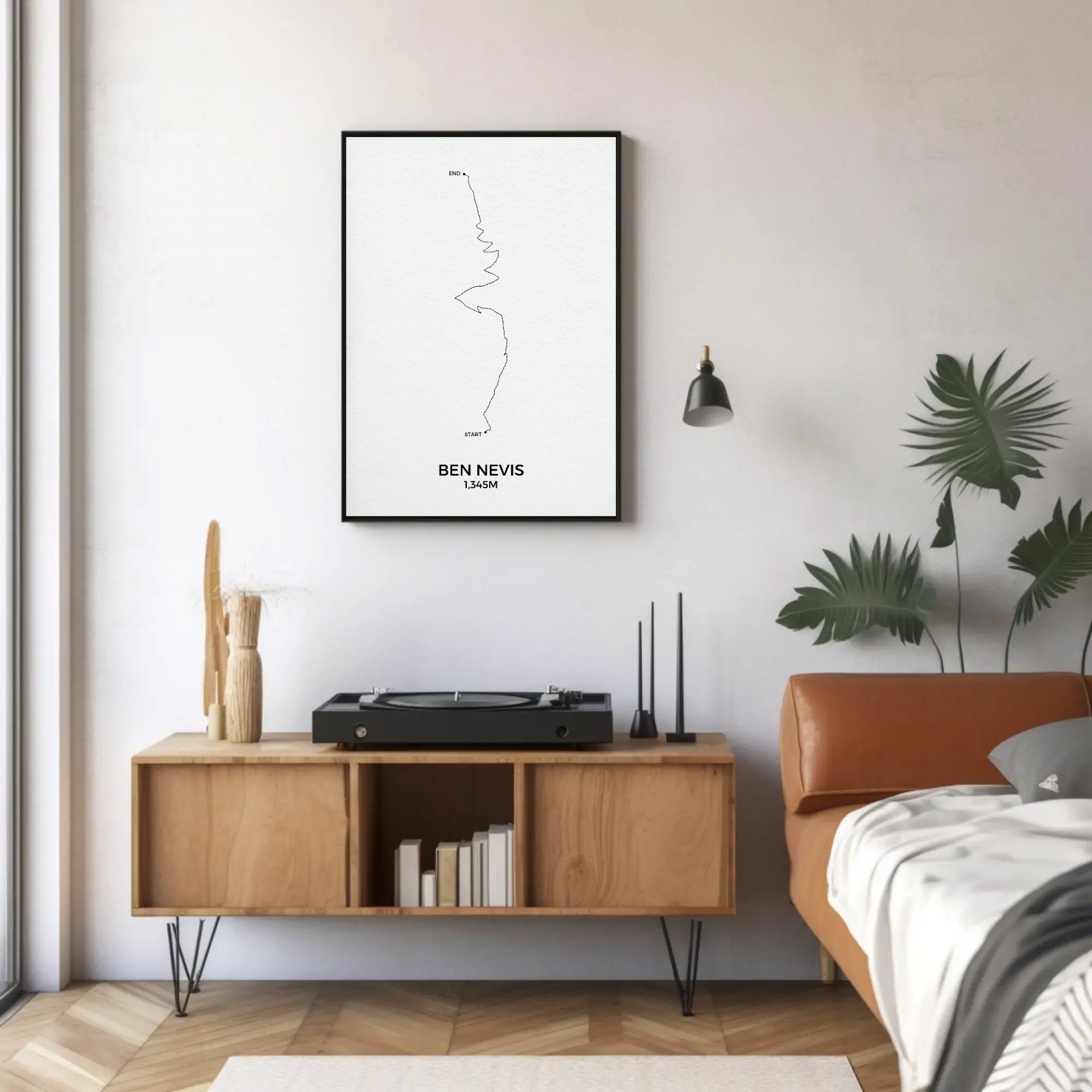
Do you want to display a travel poster, art print, or a map of your travels in your home? This guide covers layouts to use, print sizes, and home decor aesthetics, making your home remind you of your travels, without it looking like a souvenir shop.
Most people usually don’t know where to put their print or how to arrange it so it looks nice next to your existing art pieces. The problem is rarely the print. It’s not knowing how big to go, how high to hang it, or what to put next to it.
If you haven’t picked a keepsake yet, start with our guide to choosing a travel keepsake that fits the trip.
Selecting Your What To Display
Choose a cohesive theme:
Most of our prints are minimalistic, so they are easier to combine with other photos and prints, but still when creating an art wall, it’s best to think about a specific trip, geographical location, a timeline of events or simply a unified colour pallet with an accent colour if needed.
Mix mediums and sizes:
Combine professional art prints with art prints, varying the scale (e.g., one large statement piece paired with smaller, intimate snapshots) to create depth.
For example: Highlight your backpacking trips and showing off every route map for each country you’ve visited, but also incorporate fine art prints in with it.
Edit ruthlessly:
If you’re printing your own photographs, pick only the images that evoke the strongest emotional connection rather than trying to display every photo, and remember to use the same colour scheme.
Choosing Frames and Materials
Match your interior style:
Select frames that complement your existing home decor sleek black or natural wood for modern spaces, ornate or vintage frames for eclectic rooms. The frames that work well for most homes are matte black and natural oak colour. If you want to play it safe go for that.
Consider framing techniques:
Get a UV-protective glass for important art prints and photographs to prevent fading over time, and keep it away from direct sunlight.
Play with border styles:
Experiment with floating frames for a modern airy look, or traditional no bleed photograph, or full bleed photo that touches your frame.
Define Your Layout Style
Before picking up a hammer or ordering prints, decide on the layout style that fits your room’s vibe and the types of prints you have.
The Statement Centerpiece (Solo or Grid)
Best for: Large-scale minimalist map or collage, country outlines, or striking geometric destination posters.
How to do it: Have one oversized print stand alone on a narrow wall (like a hallway, entryway, or above a desk). Alternatively, use a symmetrical 2×2 grid of same-sized geometric posters to create a clean, modern aesthetic.
The Thematic Story Arc (Timeline or Collage Layouts)
Best for: Personalised travel timelines, word collages or multi-destination art.
How to do it: Group prints that share a narrative. For instance, arrange a family road trip collage alongside a map print of the specific region, aligning them together to maintain visual order.
The Gallery Wall (Asymmetrical & Dynamic)
Best for: Mixing different styles such as pairing a minimalist trail map with graphic typography prints and mixing it in with your personal travel photography.
How to do it: Anchor the wall with one medium-to-large print slightly off-centre, then build outwards with smaller complementary prints. Keep spacing consistent (about 2 to 3 inches between frames) so the wall looks curated rather than cluttered.
This is great for those who want to build a wall full of their own travel stories but want to build it up as they go on trips and holidays.
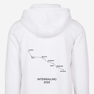

Choose the Right Print Sizes
Selecting the right dimensions prevents your travel art from looking lost on a massive blank wall or overwhelming your travel corner.
Small Prints (A5 to A4 / Approx. 5×7” to 8×11”)
Ideal use: Perfect for tight spaces, bookshelves, or as part of a dense gallery wall. They work wonderfully for detailed minimalist art, trail maps, or smaller accent pieces where people will view them up close.
Medium Prints (A3 / Approx. 11×14” to 12×16”)
Ideal use: The most versatile size for standard living areas, bedrooms, or home offices. A medium-sized travel poster or art print make a great stand-alone piece on a narrower wall.
Large & Statement Prints (A2 and Up / Approx. 16×20” and larger)
Ideal use: Designed to command attention. Use large formats for focal points above a sofa, bed, or dining room. Oversized minimalist maps or custom destination collages shine in this size, turning your favourite travel memories into true pieces of modern interior design.
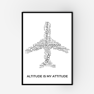
 Select options This product has multiple variants. The options may be chosen on the product page
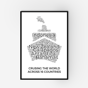
 Select options This product has multiple variants. The options may be chosen on the product page

 Select options This product has multiple variants. The options may be chosen on the product page
Match Your Art Style to Your Room’s Aesthetic
Minimalist and geometric travel art naturally lends itself to contemporary, Scandinavian, or modern industrial interiors because of its clean lines and structured shapes.
Let Negative Space Breathe:
Minimalist art relies heavily on blank space. Don’t crowd minimalist prints with too many heavy frames nearby; give them room to “breathe” so the destination typography or line work stands out.
Frame with Intention:
- Black or Dark Wood Frames: Ground geometric posters and add sharp, modern contrast.
- Natural Oak or Light Wood Frames: Soften minimalist line art and bring warmth to neutral spaces.
- Simple White Frames: Keep the focus entirely on the graphic elements and destination details, making the wall feel light and airy.
Creative Styling and Lighting
Incorporate context:
Pair your art prints and photographs with physical mementos collected during your travels, such as pressed flowers, vintage maps, or small artifacts placed nearby.
Optimise lighting:
Position your displays to catch natural indirect light, or install picture lights and warm spotlights above key pieces to mimic a professional gallery.
Create a storytelling corridor:
Transform transitional spaces like hallways or staircases into a “travel timeline,” ordering your prints chronologically or by the journey’s path.
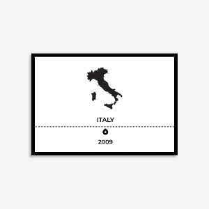
 Select options This product has multiple variants. The options may be chosen on the product page
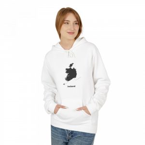
 Select options This product has multiple variants. The options may be chosen on the product page
 Select options This product has multiple variants. The options may be chosen on the product page
 Select options This product has multiple variants. The options may be chosen on the product page
Quick Pro-Tip: Mock It Up First
Before putting holes in your walls, cut out pieces of scrap paper to the exact dimensions of your chosen print sizes and tape them to the wall. This lets you play around with layouts—whether you’re mapping out a grid of geometric posters or an organic gallery wall—ensuring the balance feels just right for your space.
Take the Leap
Subscribe & Save 10%
Get the latest blogs, products, and 10% off when you sign up for our newsletter.
FAQs
How to Mix Minimalist Art with Personal Photos
Mixing graphic destination posters with personal photography can sometimes feel chaotic if styles clash. Here is how to harmonise them:
-
The 70/30 Rule: Let one style dominate. For a clean, modern aesthetic, make 70% of your wall minimalist art and custom maps, using your personal photos (the remaining 30%) as intimate focal points that draw people in closer.
-
Convert Photos to Black and White: If your personal travel photos have wildly different lighting, colour grading, or clothing styles, convert them to black and white. This instantly bridges the gap between colourful or monochromatic minimalist art and real-life snapshots, giving the entire wall a cohesive, high-end gallery feel.
-
Pair Text with Imagery: Place a minimalist typography print or country outline right next to a candid photo from that same trip. The graphic print provides clean structure, while the photo provides emotional warmth.
Best Layout for Mixing Art and Photos?
-
The Hybrid Grid: Alternate a framed personal photo with a framed minimalist travel print in a strict grid layout. The contrast between structured graphic lines and organic human moments looks exceptionally sharp.
-
The Satellite Layout: Hang your largest custom map print right in the middle, and “orbit” it with smaller personal photos and matching minimalist destination icons. It literally maps out your world with your memories living inside it.
How do I mix color travel photos with minimalist or monochrome travel art without the wall looking chaotic?
The secret is creating a bridge between them. If your personal photos have clashing colors, try converting them to black and white or a warm sepia tone. This instantly ties them into the clean, graphic aesthetic of minimalist posters and custom maps. Alternatively, use uniform framing (like matching slim black or natural oak frames) to anchor both styles together under one cohesive look.
How do I choose the right print size for a narrow hallway or a small wall space?
Stick to small-to-medium formats like A5 up to A3 (roughly 5×7 inches to 12×16 inches). Avoid oversized prints on narrow walls, as they will overwhelm the space. Instead, a vertical stack of two medium-sized minimalist destination prints or a neat 2×2 grid of small geometric posters works wonders in tighter areas like entryways or stairwells.